top of page

Is the current L-CMD Research Foundation website intuitive and encouraging to existing and potential donors?
Oct - Dec 2022
L-CMD Research Foundation is a non-profit organization founded by Austin’s parents after he had been diagnosed with L-CMD (a rare and fatal genetic disease of childhood muscular dystrophy). Thus, this non-profit aimed to urgently translate available medical technologies into treatments and ultimately find the cure. This project uses moderated remote user testing to find usability problems throughout the website and provides potential solutions for its navigation, visuals, and content. Also, we hope to encourage more people to donate on the website.
CLIENT
L-CMD Research Foundation
CONTRIBUTION
Analysis: summarize and analyze pre-test/post-test questionnaire responses and interview answers, finding 3 on the Research page and its recommendations, SUS score calculation
Materials: task & scenario, moderator checklist & script, consent form, post-test questionnaire, presentation deck, final report
Team Collaboration: moderator for 3 tests, notes taker for 3 tests, arrange and set agenda for the weekly team meeting, files organization, present to the client
TEAM
ARK (Alya Zouaoui, Roey Wang, Kato Oppenheim)
Goals
Our client, L-CMD, is a non-profit organization based in Texas whose mission is to translate available technologies into impactful treatments for L-CMD urgently.
According to the first client meeting, there are 3 goals that our client mainly wants to achieve through this user testing:
-
Any advice on critical areas of improvement or addition would be good, as well as user-friendliness and storytelling
-
How to implement those changes
-
To find out whether it is easy for users to understand current website content
Methodology
Preparation for the Study
The research team was interested in understanding whether past website users would have overlapping comments with new users. Thus, potential participants were recruited both internally (through connections with the client) and externally. The recruits were asked to fill out a screening questionnaire developed by the Pratt research team (see Figure 1), which was used as a guide to qualify and select participants. It also provided the research team with additional demographic information and experiences with donating. At last, 8 individuals participated in the study, 4 of whom were internal recruits who had previously visited the L-CMD Research Foundation website. Since all participants were spread around the United States, thus we employed remote moderated user testing to collect qualitative and quantitative data, including observations during the testing.


Figure 1: Partial view of user screening questionnaire
Participant Profiles
Based on the pre-test questionnaire, we gained a specific understanding of the age range, income level, frequency of donation, and familiarity with the website of our participants (Fig. 2-5).

Fig 2: Age Distribution of Participants

Fig 3: Average Income of Participants
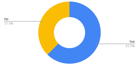
Fig 4: Have you made multiple donations to the same organization in the past?

Fig 5: Number of times participants visited L-CMD Research Foundation’s website in the last year
Tasks To Understand Usability When Navigating & Accessing Resources
We developed a set of 4 tasks that we believe would map to the real user’s experience while navigating the website. These tasks were built upon topics explored in the kick-off meeting with the client and reflected our team’s understanding of the usability and function of the website.
Scenario: You recently learned about a rare genetic disease called L-CMD and are interested in donating to a non-profit organization that aims to support the advancement of research on this disease.
Task 1: “What information do you know about L-CMD upon landing on the home page?”
Task 2: “Starting from the current page, locate the organization’s vision. What do they aim to achieve? What are the organization’s goals?”
Task 3: “Knowing the organization’s vision and purpose, locate the research groups the organization supports. Is there a project that you would like to support?”
Task 4: “After finding out more about each of the research projects for L-CMD, you decide you want to help move medical research ahead by donating to the foundation. Is there an active campaign that you can donate to?”
Running The Test Sessions
We ran 8 test sessions with recruited participants over Zoom. Before the meeting, we gave them consent forms to ensure they were comfortable with recording. A moderator and notetaker attended these sessions.
After finishing all 4 tasks, we gave our System Usability Scale (SUS) post-test questionnaires on the Google Form (Fig. 6) to our interviewees and had them filled out before leaving the Zoom meeting.


Fig 6: SUS Post-test Questionnaire
Data Analysis
We compiled all questions and suggestions raised during the meeting into the Google sheet (Fig. 7) to give a clearer view of the user experience problems. Moreover, we use the SUS score calculation system to measure the site's overall usability. The SUS score for the website was 59.0625 (Fig. 8), below the general average of 68. By taking a closer look at our participants' actions and feedback, we were able to pinpoint our user's struggles with the site.
User Interviews
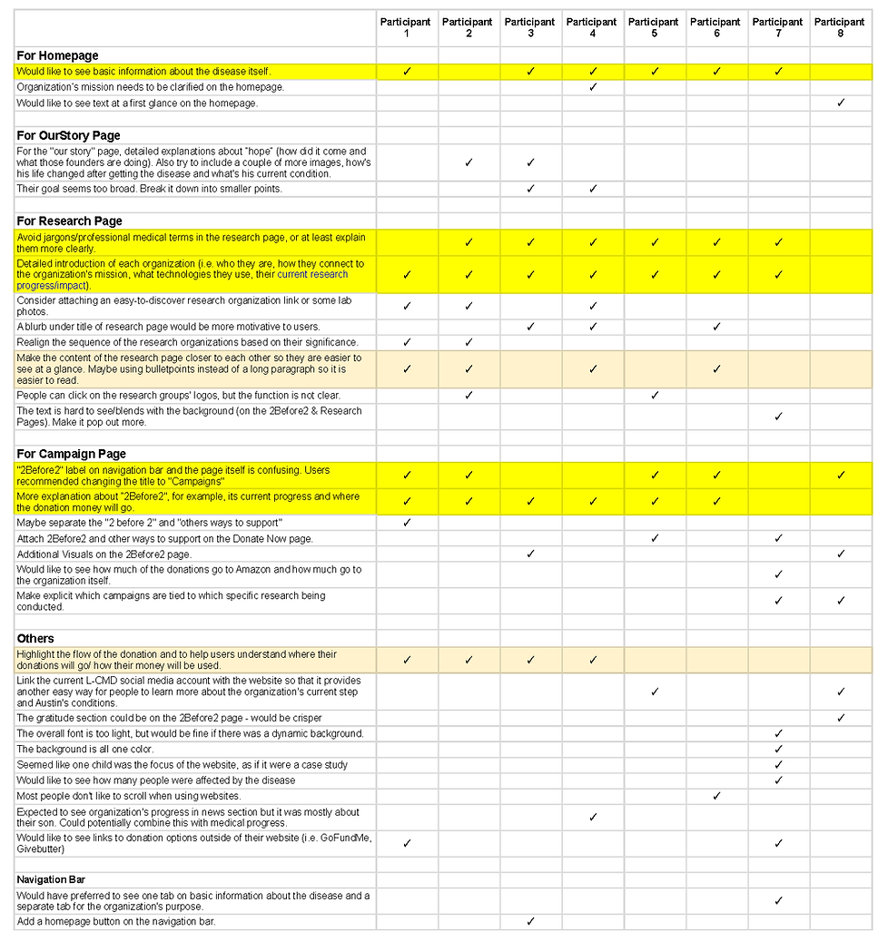
Fig 7: Interview Answer Analysis

Fig 8: Overall SUS score
Problems & Recommendations

The less you make people think, that’s what they want.


The more I’ve used websites, I learned that people just don’t scroll or want to scroll.

Key Strengths:
-
All participants praised the website’s aesthetics and smooth navigation
-
Strong storytelling skills quickly caught the users’ attention
-
Users felt a solid connection to the personal and emotional nature of the imagery, story, and reasoning behind creating the foundation
-
Users have a high desire to donate after browsing through the site
Key Improvement Areas:
-
Users need more basic information to help them learn about the disease from the start
-
Heavy cognitive load throughout the website, causing users to scroll a lot and take a long time to read through the content
-
Users struggled to understand medical terminology
-
Current research groups’ information is too vague
-
The concept of the current campaign page and the title are confusing
-
Users were confused about the flow of donations
Problem #1:
-
Users had trouble finding active campaigns when completing Task #4 (see Appendix C)
-
Users were unclear about the meaning of “2Before2 & Other Support” in the navigation bar

Fig 9: The original navigation bar
Recommendation #1: Consolidate navigation menu items to increase readability and comprehension
Despite receiving a high average navigation rating of 4.5/5.0 in the post-test questionnaire, participants encountered issues finding an active campaign on the website. Specifically, five out of eight participants struggled to understand the purpose of the "2 Before 2! & Other Support" section in the navigation bar. They only grasped its connection to a specific campaign after clicking through and reading the descriptor text. Task #4 also proved notably difficult, taking 2-3 times longer to complete than other tasks. One participant remarked that this task was the most challenging to find among all tasks.
A clear navigation bar is a light in the dark to help users seek information when landing on a new webpage. We recommend making the following adjustments to the navigation menu:

Fig 10: Proposed renamed menu item
Renaming “2 Before 2! & Other Support” to “Campaigns” would bring clarity to the type of information available on this page and reduce the time users attempt to guess the information of an unfamiliar page titled “2 Before 2! & Other Support.”
Problem #2:
-
Half of the users did not scroll below the image on the homepage to find the information introducing the L-CMD Research Foundation
-
Upon landing on the homepage, users who had not seen the website before were unclear about what the disease was
.png)
Fig 11: With the existing homepage design, users do not scroll down to see the full page
Recommendation #2: Redesigning the homepage to add emphasis to introductory information on the website
By redesigning the content and layout of the homepage, users would have a more integrated understanding of L-CMD and catch key points of why the site exists at first glance. We suggest shrinking the current image size to help the text pop out more without compelling users to scroll. We also recommend adding critical information about L-CMD on the homepage to give users a clearer understanding of what it is from the start.
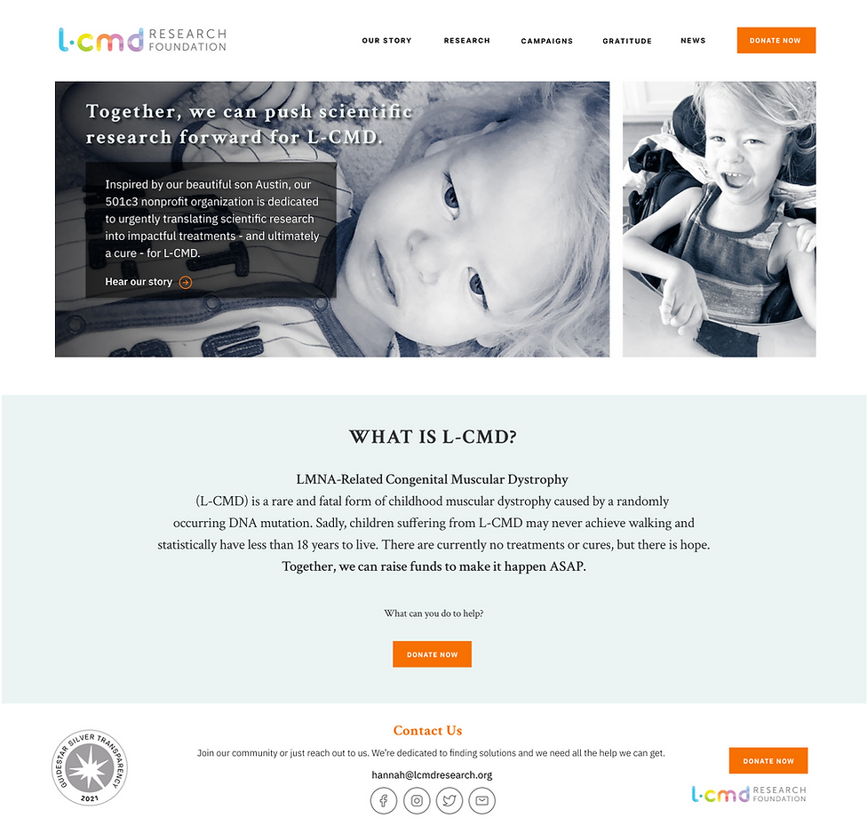
Fig 12: Proposed restructed homepage
Problem #3:
-
Users faced difficulty understanding content on the "Research Page" due to complex medical terminology and acronyms
-
The structure and layout of the content hindered users' ability to read, process, and retain information for Task #3
-
Users anticipated finding more details about research study progress and their alignment with the organization's goals
-
Users also expected more information about the research organizations, but the functionality of clicking on logos to access this was not evident
.png)
Fig 13: Current Research Page Is Text-heavy And Lack Of Clear Visual Information Hierarchy
Recommendation #3: Establish a clear information architecture on the “Research” page to help users locate information
Here is the revised layout of the entire research page:

Fig 14: Proposed restructed research page
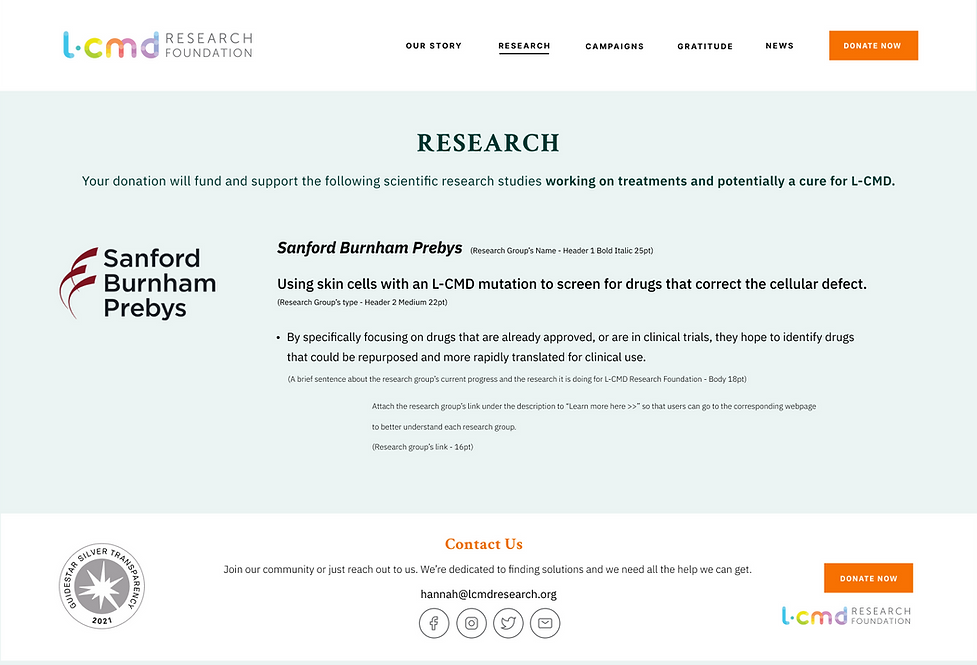
We recommended using the following style guide that addresses a stronger visual information hierarchy while compiling each research group’s information.
.png)
Fig 15: Guideline for showing a research group’s information
Problem #4:
-
The layout of the content on the campaign page is not consistent
-
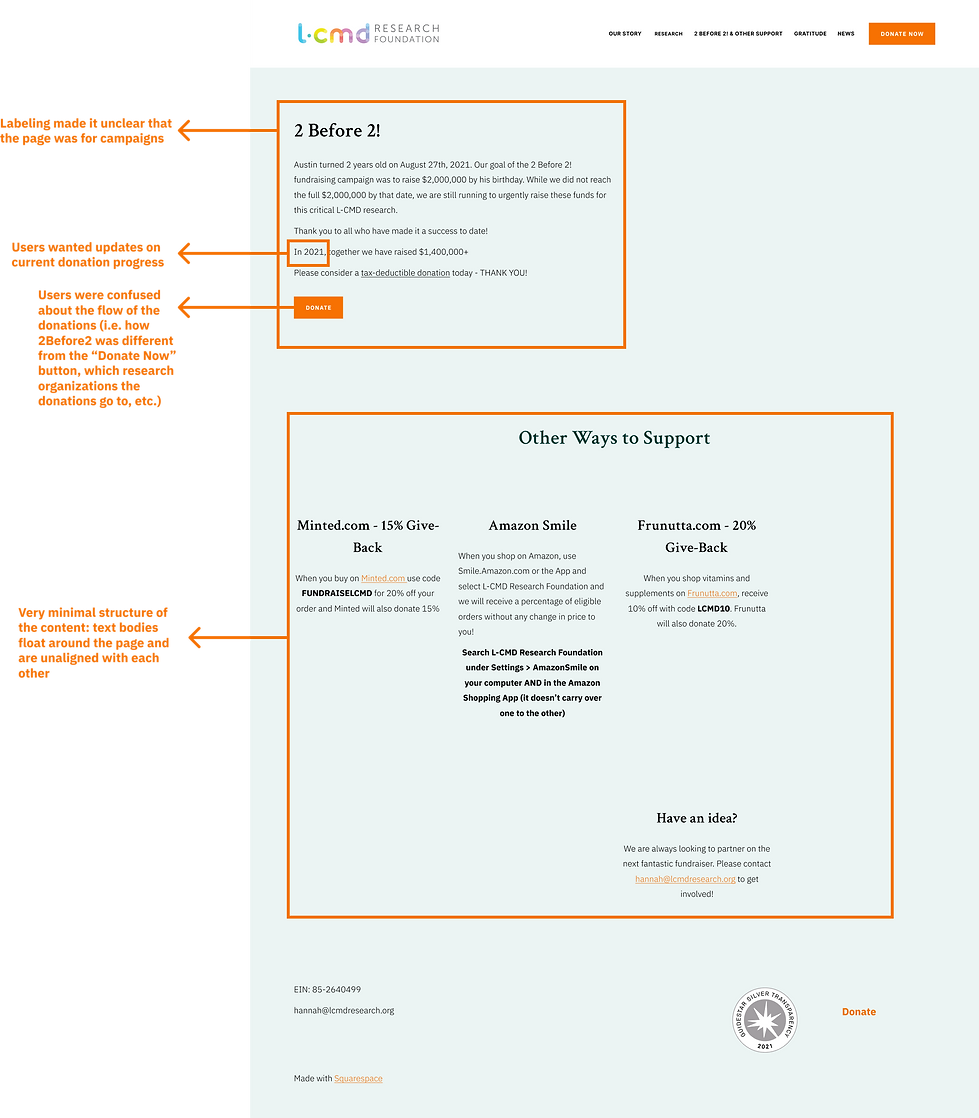
Users cannot relate the current “2 Before 2! & Other Support” page to a campaign page
-
Users were not aware of the difference between the “Donate Now” page and the “2 Before 2” campaign
.png)
Fig 16: Current campaign page with inconsistent content style and unclear labeling
Recommendation #4: Create a visual hierarchy of the content for the Campaign page and implement key details expected by users
We recommend enhancing the accessibility and discoverability of alternative donation methods by adding hyperlinks to these campaigns on the relabeled "Campaign" page. Additionally, providing more crucial details for each listed campaign, such as donation destinations and current progress, would further incentivize users to donate. To aid users in understanding the donation flow on the website, a brief introduction below the page title could be beneficial. Furthermore, restructuring the content on the relabeled "Campaign" page into a list format similar to the research page would not only add cohesion to the website but also increase the readability of the content, making it easier for users to navigate and engage with the campaigns.

Fig 17: Proposed restructed campaign page
Conclusion

Fig 18: Final presentation meeting with our client
“This is super helpful information that makes sense.”
Hannah Lowe, the founder of L-CMD Research Foundation
After presenting our findings above to our client via Zoom, the founder of L-CMD Research organization told us they were impressed by our presentation and found our results helpful. Our thoughts open a new gate for them to rethink their website’s content and layout. They also understood how real users feel about their website and what is useful and what is not. The interviewees gave various personal suggestions. Considering our project scale and the problem’s severity, we do not include all of them in our recommendations. However, I would recommend the following steps on this project would be:
-
Combine the “Gratitude” Page with the “Donate Now” Page so that when users make donations, they can directly see who supported this organization and thus be encouraged
-
Create a “Contact Us” Page that takes the content of the “Donate Now” Page into a separate content-rich page of information
-
Simplify the Donate Now Page to utilize for more significant donations
bottom of page
