top of page

Redesign An Intuitive Information Architecture & Ticketing System for the New York Transit Museum
Sep - Dec 2022
Founded in 1976, the New York Transit Museum is dedicated to telling and preserving the stories of mass transportation in New York City. The website is informative, but in another way, those heavy texts haven’t been compiled logically. Thus, our team leveraged research insights to redesign the website to support a more comfortable and convenient website browsing experience. We constructed a new information architecture and medium-fidelity prototypes for the homepage, ticket buying, group visit, and research page.
CLIENT
New York Transit Museum (NYTM)
CONTRIBUTION
Research & Analysis: user interview, empathy map, persona, card sorting, tree testing, competitive analysis, prototype testing
Design: information architecture map, Figma prototypes, medium- and high-fidelity prototypes of group/individual tickets, and homepage
TEAM
The Anti-Personas (Delali Ayivor, Nallammai Kannan, Roey Wang)
Goals
During the kick-off meeting with Jennifer Kolter of the New York Transit Museum, she identified the three areas of the website as ones that need particular attention:
1. Creating a clear and frictionless ticket-buying system
2. Creating a more streamlined, narrative experience to explore upcoming public events
3. Properly integrate group visit information and categorize
User Research
INTERVIEWS & OBSERVATIONS ON WEB WALKTHROUGH
Sample size: 6 interviewees (3 art/museum-related professionals and 3 art visitors)
After gathering information from 6 visitor interviews, we used the empathy map to organize all the information and gain insights from our research. We first put essential info from interviews on sticky notes using Miro, then grouped them together into four main categories, and at last, made a summary of each group.
KEY RESEARCH INSIGHTS
-
People want to see what’s on view from the home page
-
Group visits’ logistics and coordination become the focal point of the planning and experience
-
People are very interested in the narrative behind the work and the intention of the people putting together the museum exhibitions
-
Online booking system for tickets should always be easy to discover and process
PERSONA
This persona reflects an art visitor’s common routine of going to a museum.

How Are Similar Websites Designed?
From there, we conducted a review of nine direct and indirect competitors to the New York Transit Museum in order to propose changes for the museum’s website redesign. Each website was analyzed according to 7 dimensions: whether there was a representation of the current exhibitions on view; ease of navigation; consistency of aesthetic; clarity of content; mobile-friendliness; clarity of necessary visit logistics; and visibility of mission and values. The websites were rated on a scale of 1 - 3, with 1 equating to poor and 3 equating to excellent in a dimension.

WHAT TO IMPLEMENT:
-
Highlighting exhibits in a simple and visually appealing way
-
Making sure the homepage has a clear hierarchical organization structure
-
Editing content so it is easy to read and understand
-
Creating a uniform aesthetic for the website
-
Making sure the mobile experience is equivalent to the web experience
-
Emphasizing logistics information and creating a straightforward ticket-purchasing process
-
Highlighting the “whys” of the museum and communicating its mission and purpose
Site Map Revision
Our team conducted 3 moderated and 6 unmoderated card sorting studies to analyze the existing information architecture of the New York Transit Museum’s website. Utilizing the results from our 9 participants, we drafted an improved and more efficient IA, which we then assessed using a tree-testing study. 10 participants were involved in our tree-testing study: 6 in an unmoderated, asynchronous setting and three in a moderated setting. We used the results from this tree test to refine our re-designed information architecture further.
.png)
CARD SORTING
-
Our card sort included 38 cards taken directly from dropdowns of the top-level navigation of the NYTM’s website. We eliminated any redundancies and renamed any tabs that lacked clarity.
-
Our 9 participants were given background information about the exercise and asked to group the tabs into categories. The majority of our participants created 5-6 categories. As one participant in our moderated exercise said, they were grouping by asking, “Where would I click to find this information on a website?”
.png)
After collecting card sorting results from 9 participants, we used the similarity matrix to sort card ranking for each category. We put cards that the majority has agreed on in the tree testing model. Based on the result of card sorting, we created our first draft of the revised IA Map.
%20(1).png)
TREE TESTING
We developed 5 tasks for the tree testing to ensure accurate navigation for "ticket purchasing," "covid procedures," "current exhibitions," "group visits," "accessibility," "virtual programs," "Programs for children," "Joining membership," and "hosting an event."
Our tree test had 10 participants, 7 unmoderated and 3 moderated tests. We asked participants to complete tasks to probe the points of our revised IA map, which created confusion.

%20(6).png)
%20(2).png)
%20(3).png)
%20(4).png)
RESULT: REVISED INFORMATION ARCHITECTURE

Wireframing & Iteration
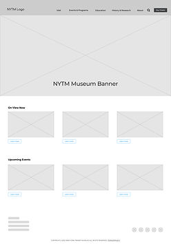
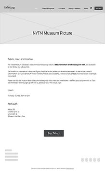
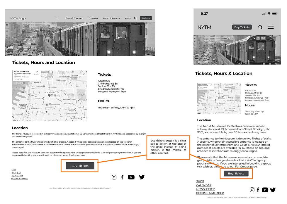
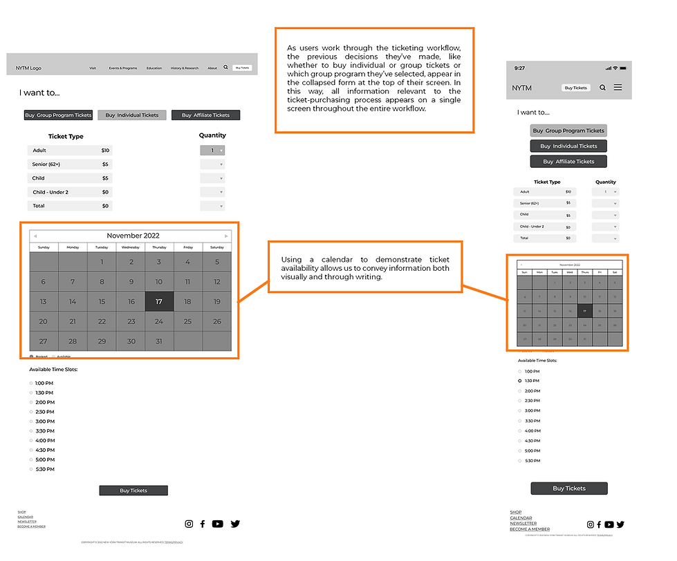
After we finalized our sitemap, we explored ways to order our content on these pages. Our design process began with ideating and creating interactive low-to-medium fidelity prototypes on Figma.


-2.jpg)
-1.jpg)
-15.jpg)
-22.jpg)
USER TESTING
We conducted 6 moderated user tests on our interactive paper prototypes and made 3 improvements for our later medium-fidelity prototype design:
-
More information about group programs when buying tickets: since it’s a medium fidelity, users cannot distinguish the differences between each program and want to know more about it without jumping to another page
-
Adding in a method to share group program information with other people and to add it to your personal calendar: users want to have this function enabled to have a better booking experience
-
Adding filters in the calendar view to filter by dates and times that work for the user: adding this function will help prevent users from choosing the unavailable time spot and wasting their time
HIGH FIDELITY PROTOTYPE
We revised the mid-fidelity prototypes and developed high-fidelity prototypes based on user testing. We standardized fonts, text-indent, size, and icons at this stage. We also redesigned the calendar feature and filled in event information to see if the visual layout was appropriate.


Final Thoughts
INTERVIEWS & OBSERVATIONS ON WEB WALKTHROUGH
This was my first time working on a full-scale design project, and it was overall a precious experience for me. It was particularly insightful to start this project by conducting user research to understand better what is essential to the intended audience. Being able to analyze other similar websites was very helpful for me in understanding the elements that work and don't work for UX design in general. Moreover, a good teamwork vibe encouraged me to speak loudly and not be afraid to communicate. As a facilitator, I was in charge of organizing weekly meetings and regulating the group working process. Distributing work evenly and setting up proper working deadlines ensured the smooth completion of the whole project.
bottom of page
