Analyzing How Smarthistory Users Navigate and Find Content Using Eye-tracking Techonology
FEB - MAY 2023
Smarthistory is a non-profit educational resource website that provides free and open access to high-quality videos and essays about art and cultural history. Its content covers a wide range of topics, from ancient to contemporary art, and is presented in a conversational style that is engaging and easy to understand. With this collaboration with Pratt, Smarthistory wants to conduct a deep usability test with its current desktop and mobile website to find out some user experience issues that hinder users from smooth navigation on this website.
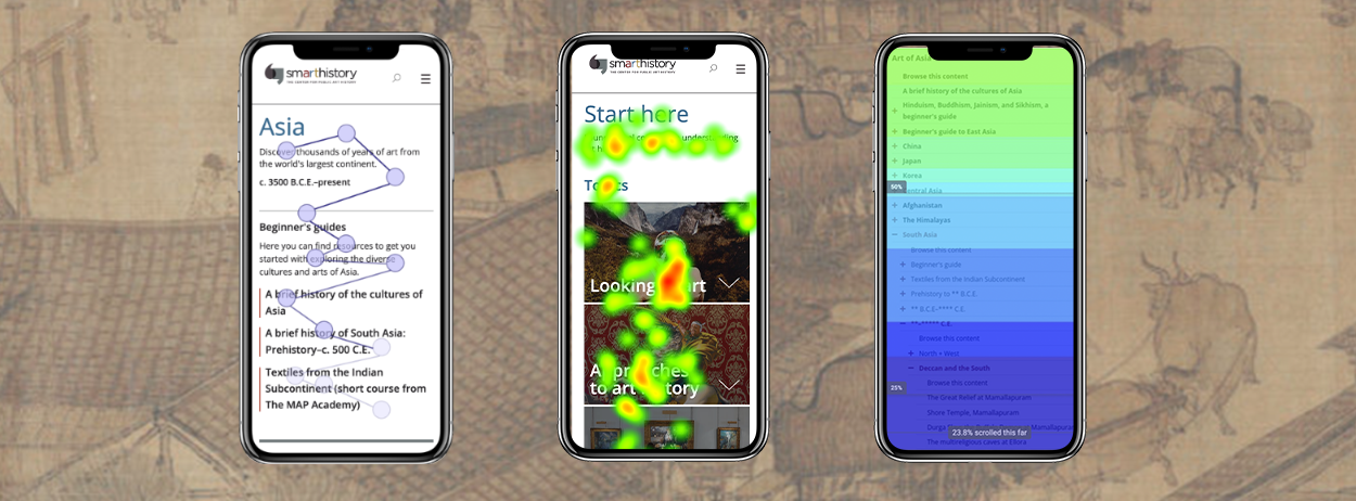
Our team is in charge of analyzing Non-Euro, Prehistoric, and Start Here pages on mobile. Our team conducted an eye-tracking study to support our client's mission based on findings from the website Google Analytics report and Hotjar maps. We use Tobii Pro Lab to help evaluate and identify user journeys and how they perceive certain topics.
CLIENT
Smarthistory.org
CONTRIBUTION
Research & Analysis: user interview, eye-tracking lab, data analysis, gaze-plot report, heatmap generation
Team Lead: weekly meeting, team discussions, task assignment, recommendation consolidation, problem list creation
TEAM
Originators (Jiafeng Lu, Roey Wang, Shuyang Lin, Srishti Dokras)
Goals
To study the user journey across the Non-European/Prehistoric + Start Here page categories on the mobile version of the Smarthistory website to find out how users access the content so that we can remove any obstacles that they face in finding the information they are looking for.
Pre Eye-tracking Study
Before conducting the eye-tracking task, we analyzed the current website performance through Google Analytics and Hotjar to see user journeys, and here are some key findings:
1. The direct link is the main way mobile users use to navigate to the content page. (Most source pages are educational sites or Google Docs/lens instead of the organic search engine.)
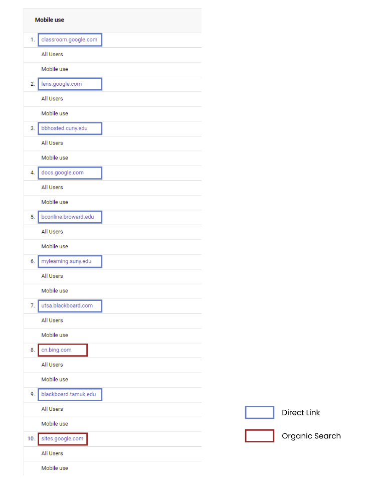
Source Medium Data From Google Analytics
2. High entrance and exit rates mean low user engagement with the page.
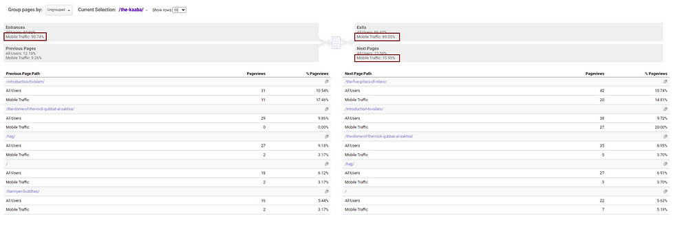
Entrance & Exit Rate From Google Analytics
3. Users don't use the beginner's guide often; they tend to use the category area more frequently. The guide also occupies a large area on the mobile.
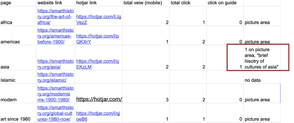
Number of Clicks on Beginner's Guide From Hotjar


Scroll Map & Heat Map From Hotjar
4. While some users scroll to the navigation at the bottom of the page, they do not seem to be interacting with the navigation. The navigation does not encourage them to explore similar content or use it to navigate to other categories.

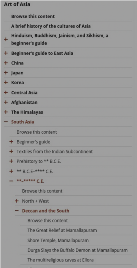
Scroll Map & Click Map From Hotjar
Eye-tracking Analysis
Based on findings from Google Analytics and Hotjar, we come up with four research questions that we want to dig deeper into through the eye-tracking test:
-
How do users use or perceive the landing pages?
-
What are users' behaviors with the bottom navigation on the content page?
-
What layout difficulties are users experiencing when searching for information?
-
How do users perceive the Start Here page?

Eye-tracking Tasks:


Recruiting Participants
We recruited a total of 10 participants who had average familiarity with the art history. We believe these participants were a close reflection of Smarthistory's targeted audiences. Each participant was asked to complete the consent form, tasks, a System Usability Scale survey (SUS), and a post-test questionnaire.
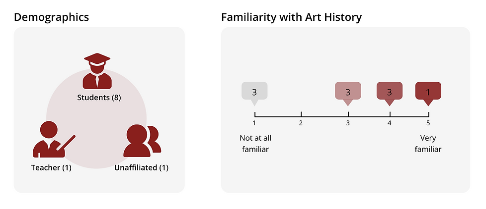
Participants' Basic Info
Collecting Qualitative Data & Quantitive Data
We organized the qualitative data in Figma's discussion board and labeled similar research question-related findings in the same stick notes color. Our team also used the visualization tools from Tobii to find out what people tended to look at and in which order they were looking at items on each page. To learn more about the website's usability, we recorded participants' progress in task completion and replayed it to have them think aloud about each step they made.

Qualitative Data Analysis Through Figma


Sample Quantitive Data Analysis Through Tobii Pro
Problem List
By categorizing our interview notes and post-test questionnaire, we develop the following problem lists to help narrow down our final decision scope.
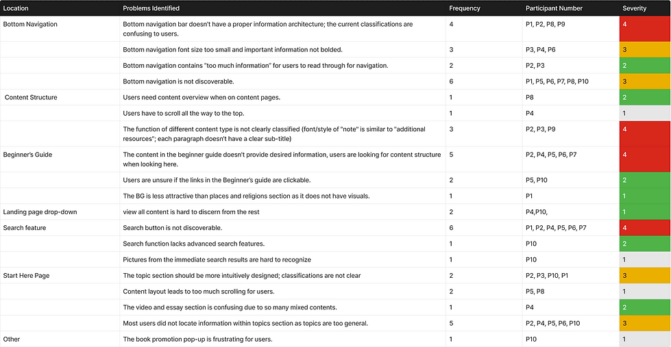
Problem List
Findings & Recommendations
Site Overall Performance
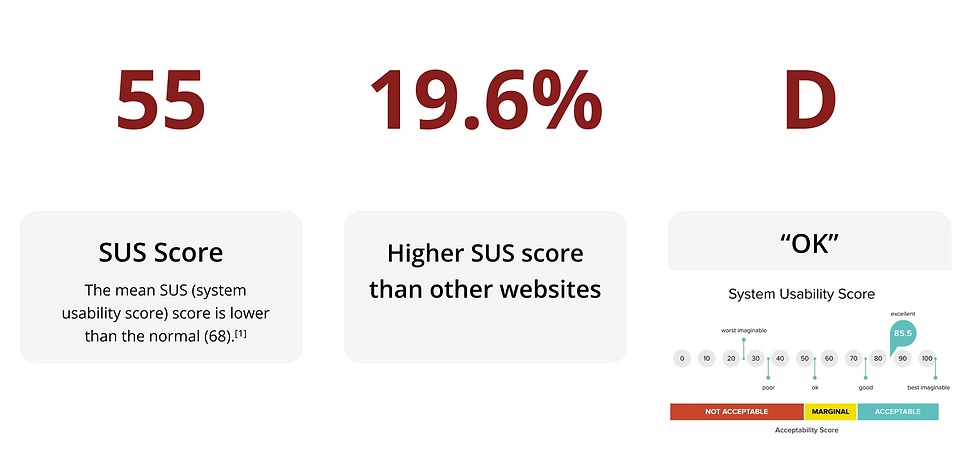
The average SUS score was 55, meaning the Smarthistory website is ranked under the 19.6th percentile of all websites and considered 'OK.' This shows that our users were not satisfied with how user-friendly and easy-to-access the website was.
Finding 1
1.1 Users found the Beginner’s Guide section lack of relevance to what they are looking for.
-
50% of users expressed their dissatisfaction with the content in the Beginner’s Guide.
-
They only clicked on the article because they found keywords related to the task prompt in the title.
1.2 The section lacks visual cues for users to engage.
-
Articles in the section look unclickable.
-
20% of users expressed their confusion about links to articles.
-
No icons or pictures make the section less attractive.

I want to know how this page is organized.
I don’t see how this is directly linked to things I am searching for.

Users Didn't Engage With the Beginner Guide
It looks like a bullet point, so I skip it.

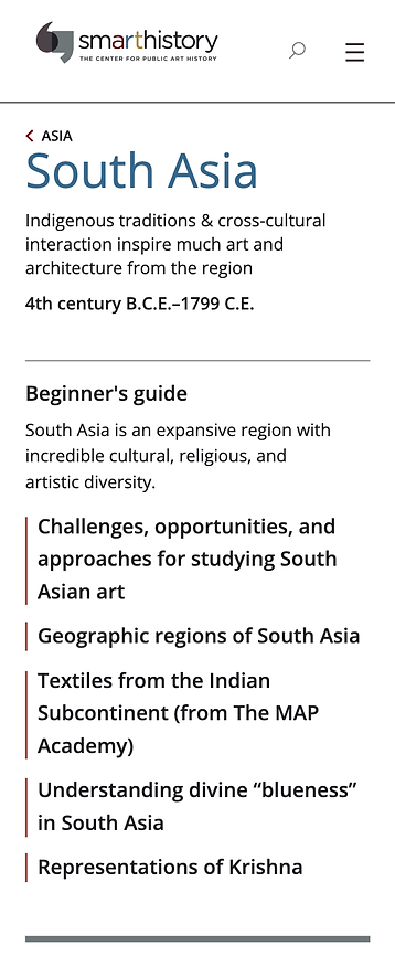
The Current Beginner's Guide
Recommendation 1
-
Reorganize the content displayed in the Beginners’ Guide by condensing existing articles and adding the search guide.
-
Add visual cues to increase visual engagement and to indicate links.
-
Change the color of the title to blue and underscore them to signify clickable links.
-
Add an arrow icon next to each article title to encourage users to read more.
-
Add icons to increase engagement and present information more straightforwardly.
-

Original vs. Recommended Mock-up
Finding 2
2.1 Users found the information structure of the bottom navigation to be overwhelming and confusing.
-
50% of users found the current classifications confusing and thought there was “too much information” in the bottom navigation.
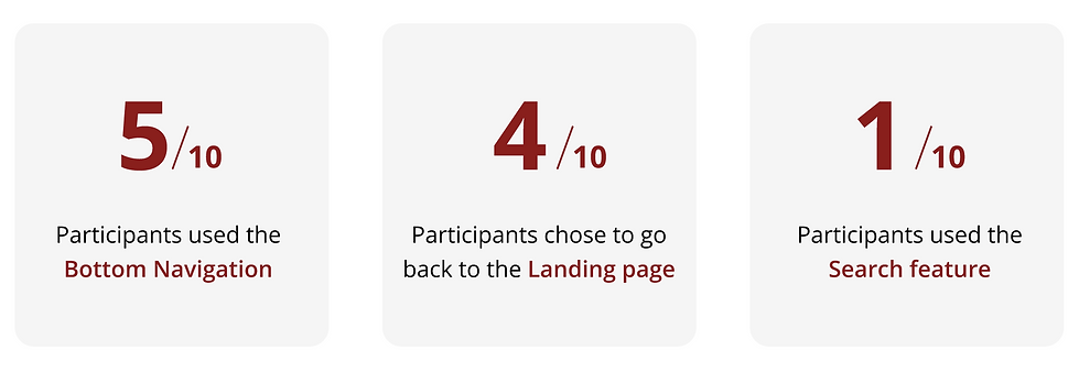

This was confusing.. it was categorized by location first, then time.. then location again?

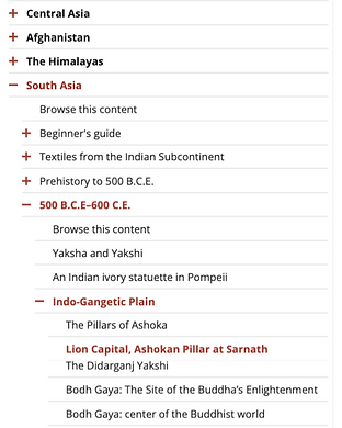
Confusing Bottom Navigation
2.2 Users found reading the content on the bottom navigation challenging due to the small font size on mobile devices.
-
3 users thought the font size in the bottom navigation was not large enough and that information “should be bolded.”

Zoom-in Gif
Recommendation 2
-
Increase the font size and the accordion target to make it easier for users to read and interact with the bottom navigation.
-
Reduce the amount of information displayed in the bottom navigation by including only the higher-level content categories.
-
Further, many users faced difficulty with understanding content categorized by time. There’s a potential to conduct further card-sorting tests to help learn more about the information hierarchy and reorganize it.

Original vs. Recommended Mock-up
Finding 3

Finding 3 Result
-
Participants find it challenging to navigate the content page due to the lack of features like a content overview, font/style differences between sections, and direct links to specific areas like "Notes."
-
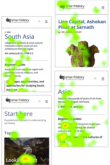
Additionally, mobile users struggle to discover the search feature, with only 6% using it on mobile devices. Heat map data suggests users may miss the search icon due to content-heavy pages and not scrolling back to the top.

Example of Confusions in Notes Area
Cumulative Heat Map
Recommendation 3
Increase browsability by adding the table of contents and summary chart of the art piece at the beginning of the article.
-
Add a summary section at the beginning to inform users who are looking for basic information
-
Add a Table of Contents to tell users what information is in the article
-
Add links to notes so users do not need to find them manually
-
Change the color and font of the notes section to make it discernable from the main article
-
Add a hanging style to the section to signify its citation nature

Suggested Summary and Table of Content Mock-up
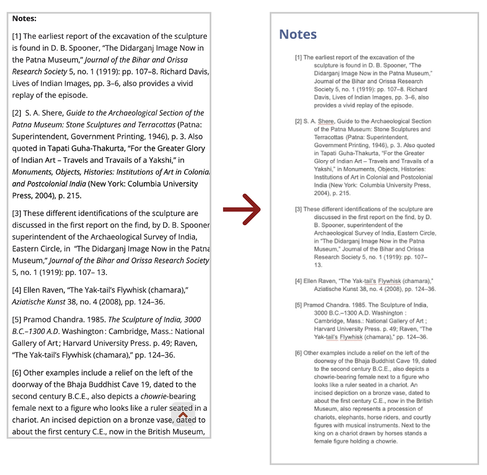
Suggested Note Mock-up
Finding 4
-
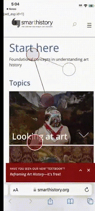
The content layout requires excessive scrolling for users. Specifically, 50% of users struggle to find information within the topics section due to its overly general classifications lacking intuitive design.
-
Moreover, the video and essay sections are confusing due to the mixture of content without clear categorization, leading to time-consuming scrolling for users trying to locate specific topics.

Why does religion come after the museum? The order seems not logical.
I did not realize I had skipped the topics part.

%20(2)_gif.gif)
Real User Scrolling
Recommendation 4
-
Add a guide at the top to teach users how to use this page.
-
Add a filter and search function in the video+essays section.
-
Reorganize the topic sections so that it’s more intuitive for users (beginners) to outline art history. (Further card-sorting/tree testing method is also recommended)

Mock-up of New Videos + Essays Section
Conclusion
The Smarthistory earned a weak SUS score for its Non-Euro, Prehistoric, and Start Here mobile pages, indicating low performance and requiring further improvements in the following aspects:
-
Reorganize the content displayed in the Beginners’ Guide and add visual cues to increase user engagement.
-
Reduce the amount of information displayed in the bottom navigation bar and increase its font size.
-
Further research to help make the bottom navigation bar has a clearer information hierarchy is recommended
-
Make the search feature more prominent.
-
Redesign the Start Here page more intuitively and add a filter and search function under the Video + Essays section.
Future A/B Test Plan
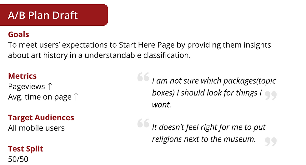
The content page consists of most website pages; its quantity is too large to do an A/B Test Plan at this stage. Thus, we suggest the Smarthistory consider conducting the A/B Test on Start Here Page. In our recommendation 4, we suggested further card sorting/tree testing to help decide the new information architecture of the Start Here page. The results will not be the single one; it will come up with several versions of test results, and based on that, we will recommend conducting the test.
How Our Clients Reacted To Our Report?
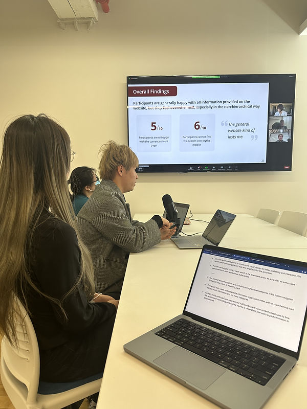

Marty Spellerberg, Digital Consultant For Smarthistory
Your recommendations and insights are very strong.

