UR SPACE
2019
UR Space is designed to be an integrated software solution together with a physical device placed in all designated study areas that allow students to better utilize the break-out rooms, study areas, and carrels at the University of Rochester.
TEAM
Lingling Li, Joanna Fang, Yiran Qiu, Ruoyu Wang
ROLE
Industrial Designer
-
Personas and Key Path Scenarios
-
Industrial Design Framework Overview
-
Physical behavior and form factor (Panel, Swipe Reader)
-
3D Model for the Panel and Swipe Reader

PROJECT OVERVIEW
Problem
The University of Rochester has two main libraries that are often amazed by its beautiful architecture and abundance of resources. However, given the complexity of architecture and non-digital library system, finding an ideal study place, study groups, and attending TA office hours are difficult and confusing.
Outcome
In order to address this problem, we designed a mobile app and a physical device placed in all designated study areas that provide students with a one-step library booking service and thus help them achieve higher study productivity.
Design
Research
Primary Research
Stakeholder Interview
Focus Group
Individual Interview
Anonymous Survey
Secondary Research
Online Research
Existing Product Sitemap
Analogous Product Analysis
Research Insight I
Study Experience highlight
-
Humanity and Natural Science students have similar study habits and share a similar
preference of study place
-
Social Science and Engineering students have similar study habits and share a similar
preference of study place
-
The most common difficulty:
-
Students: find suitable study spaces during midterm and final periods.
-
TAs and Study Group Leader: Facility problem (markers without ink).
-
All interviewees have a high adaptive ability with new technology
Research Insight II
Practical Preference
-
Mostly used screen size is 5.5 inches (iPhone 6/7/8 P)
-
People prefer a touch screen
-
A dull polish screen is more popular than a smooth screen.
-
High sensitivity is the most essential attribute of a touch screen.
Research Insight III
Visual Preference
-
Most people believe white and blue is a symbol of efficiency
-
A visual design of Gmail gets the highest recognition (4.2/5.0).
DEFINE &
IDEATE
Design Opportunity
Based on research, we identified our design opportunity:
How might we design a mobile app and a set of the physical device to make the library organizing system more efficient?
Ideation
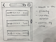
With the design opportunity in mind, we moved forward to ideation. We drafted our app's primary interfaces, visualized the library space, and tested possible visual aids for navigation.




Physical Behavior and Form Factor
Physical Behavior
Panel:
Pad-like shape; TFT Texture screen; screen protector; Aluminum alloys material;
Rubber-texture case; Taptic engine button; Wire charger
Swipe Reader:
PBC material; Speaker on the side; LED light, Data line (linked with Panel)
Form Factor
Stable:
Placed inside an unmovable frame case on the wall.
Secure:
Aluminum alloys material increases the durability and portability of the panel.
Unmovable frame case reduces the possibility of accidental fall down during daily practice.
Rubber-texture case and screen protector will prevent scrapping during daily use.
A circular bead prevents harm of sharp edge during daily use.
Sensitive:
TFT Texture screen: the most sensitive material that is currently used among similar products (same as Apple’s product).
Taptic engine button which is robust to strikes ensures a sensitive operation experience and long- lasting usage.
PERSONA &
KEYPATH SCENARIO
Kris Bergman

-
User Role: Study Group Leader
-
Goals: Effective space occupation / Availablefacilities / Suitable Physical conditions
-
Needs: Access to useful attribute information about the study place / Effective reservation system
-
Requirements: Ability to adjust the quietness level and room use /Ability to view seat availability / Ability to select and use the right facilities / Ability to choose the suitable physical environment / Ability to inform users’ the clear route

Before the study group, Kris logs into the interface. He selects the reserve function and confirms his student group leader identity. Then, he chooses and adjusts his needs for choices. After the system filters out the potential choices, he selects the one that fits his needs from the list. At last, he confirms the reservation when he finishes checking the details, and then he sends the location link to his students. Before the class, he swipes in and starts his lecture.
Annie Hoffman

-
User Role: Teaching Assistant
-
Goals: Space Forecasting / Available Facilities / Better Communication Channel between TA and Students
-
Needs: Access to useful attribute information about the study place / Access to occupancy information / Effective communication channel
-
Requirements: Ability to adjust the quietness level / Ability to view seat occupation / Ability to select and use the right facilities / Ability to set up the suitable physical environment
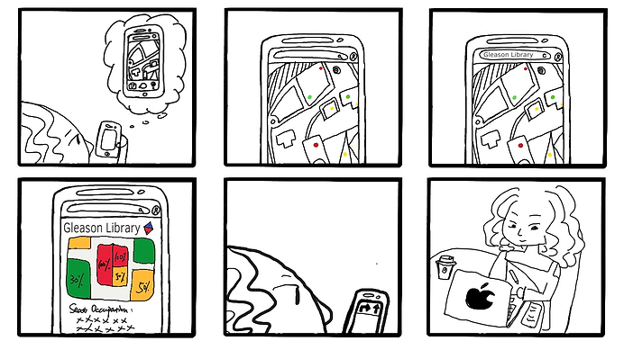
Annie opens the app and looks for a good study place to hold her office hour. She notices the clear colored signs on the map of seat occupation. Then she types into the menu bar to search for Gleason Library as her top choice and checks the seat occupation detail. Finally, she follows the map link to her ideal study space with the directing audio voice-over. Annie arrives there successfully.
Jisoo Kim

-
User Role: Student
-
Goals: Know the information such as quietness and light level / Seat occupation / Find friends in the library
-
Needs: Access to useful attribute information about the study place / Access to occupancy information / Sensitive navigation system
-
Requirements: Ability to view seat occupation / Ability to navigate routes using maps and audios / Ability to set up a suitable physical environment / Ability to invite classmates to join the same study section

After choosing an ideal place to study, Jisoo’s friends wait for her at the Gleason Library. She logs into the interface and opens a chat. Her friends send her the audio map link through the message page. Jisoo follows the third-person point of view directly to the library. She checks the occupation of seats at the same time. Finally, Jisoo arrives on time.
APP DESIGN & PRODUCT Design

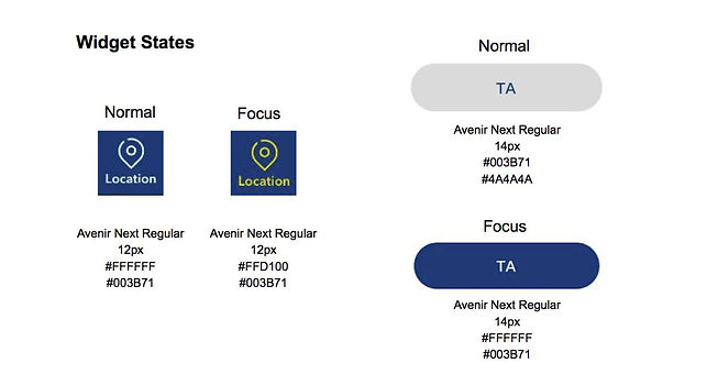
Visual Guideline

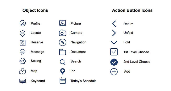
Mobile Interface Anatomy
Login & Main Menu


Navigation

Reservation


Message


Setting

Panel Interface Anatomy
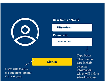
Login


Main Menu


Physical Model Anatomy
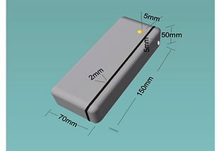
Product Size

Panel
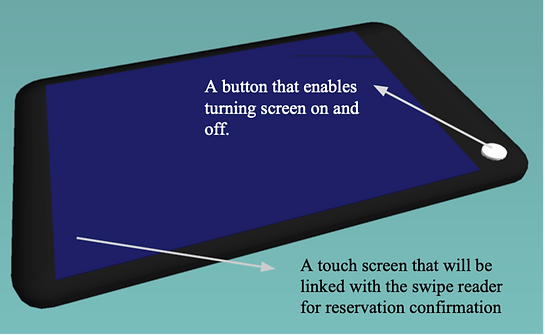
The panel will contain a touch screen, and there will be a single button on the side for turning on
and off. In order to implement the friction-free feature (MRD, Risk Factor: Friction-free), the panel
will present the information through suitable screen lighting and clear arrangement that provides
straightforward data.
Swipe-reader
This swiping machine will be paired up with the panel as the identity confirmation component
for the reservation system. It allows users to swipe their student card as the final step of reserving
a study space. The speaker provides the audio notification and a colored light button notification
to inform users whether they successfully finish the reservation system.

User Map
WHAT I LEARNED
Team Efficiency
I learned to use methods such as shared to-do-lists and critique documentation to organize the team's progress and improve efficiency.
Communication
I matured my skill to assertively communicate with my team in a timely manner and address disagreement with mutual compromise.
Courage
I gained the courage to give bold ideas that seem to be challenging but potentially fruitful a try. Moreover, I challenged myself in an unknown area (3D Modeling) and learned to be a qualified industrial designer.
